Visualising electricity demand: use and users of a 3D chart from the 1950s
Abstract
https://dx.doi.org/10.15180/180905/001Showing electricity demand by the hour, day, month and year, this 3D chart offers a rich visualisation of energy data in the UK from the years 1951–54. Acquired by the Museum of Science & Industry, Manchester, the object is significant as a tangible record of past practice, both of the electricity supply industry and its consumers. In this paper, we offer a close inspection of the object, and following its clues, we generate ideas about the chart’s use and users. In addition to commenting on the rhythmic patterning of daily and seasonal loads, we reflect on the role of the object at the time of its construction, in terms of forecasting, price-setting and load-shifting, and lobbying and demonstration. The object literally materialises electricity demand, providing a distinctive 3D representation, and in so doing prompting questions about how demand changes over time, and in time, and how our practices of everyday life constitute this demand. We conclude by offering a new interpretation of the object as a tool, as well as historical data.
Keywords
data visualisation, electricity demand, electricity supply, load curve, load model, Manchester, material culture studies, object analysis
Introduction
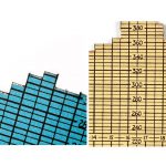
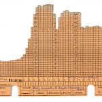
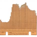
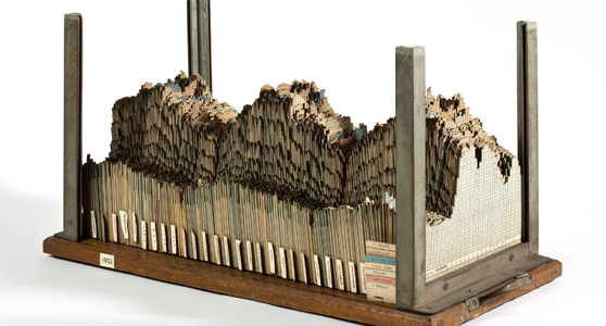
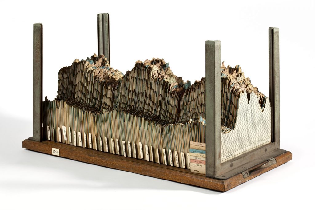
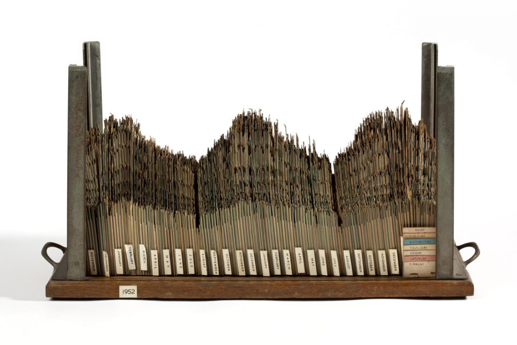
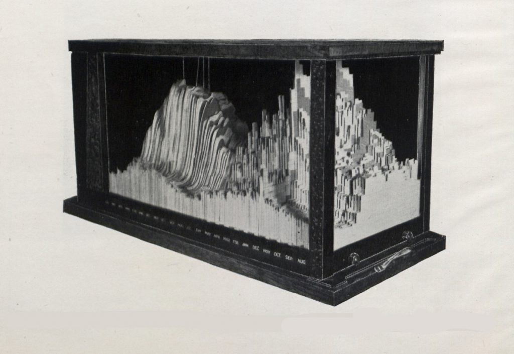
https://dx.doi.org/10.15180/One object in the collections of the Museum of Science & Industry (MSI), Manchester, literally materialises electricity demand – a 3D chart showing demand by the hour, day, month and year, in the Manchester area, for the years 1951–54 (see Figure 1). It is comprised of 675 cards, each of which is known as a ‘load curve’ or ‘load profile’, referring to demand as ‘load’ on the grid system averaged over a time interval of a given duration, in this instance thirty minutes. Assembled as a 3D chart over a longer time period, it was known within the electricity supply industry as a ‘load model’. Selected for the collaborative exhibition ‘Electricity: The Spark of Life’ (at Wellcome Collection, the Teylers Museum, and forthcoming at the Museum of Science & Industry, opening 18 October 2018), we wanted to take the opportunity to consider its use and users at the time of its construction.
This article unpacks this material object – a 3D chart of energy demand – and looks at its various components to see what we can learn from such a method for the history of energy supply and consumption. The object was acquired by the Museum of Science & Industry in 1990, as part of a large donation of objects and archives from the Central Electricity Generating Board (CEGB) and the Electricity Council, concurrent with privatisation of the industry. The catalogue record states that it was used by ‘Central Electricity Generating Board planners’, but does not describe its exact purpose. In this article we offer some speculative answers, using an interdisciplinary approach to object analysis drawing on material culture studies (), museum studies (Pearce, 1994) archaeology and sociology (), and combining material and documentary/archival evidence to generate lines of enquiry and interpretations. While there is a growing body of literature relating to the history of the electricity supply industry (; ; ; and a forthcoming collaborative PhD thesis by Paul Coleman), load models such as this have not featured in their accounts. Both Hannah and Hughes discuss the use of load curves, but we did not assume that load models were used in the same way. Instead we worked from the object, generating hypotheses that could be measured against the primary and secondary literature. Likewise, it is not the aim of this paper to expand upon the broader social, economic or political contexts of this literature. Instead, our intention is to trial a methodology for an object biography – to examine the evidence afforded by the object itself, the questions it raises, and how these could be used to interrogate the accompanying documentary and archival sources, and in doing so to encourage future researchers to analyse the artefacts and material cultures of energy. How far does this approach enable us to comment on the object’s use and users, and the role of objects in telling stories about energy supply and consumption?
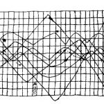
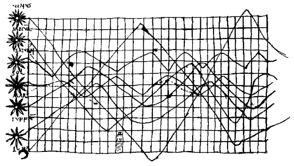
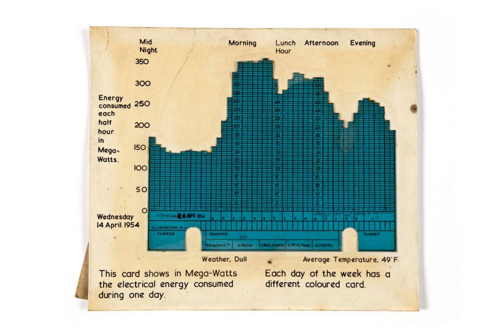
A first step is to situate the chart within the history of 3D data visualisation. Time-series graphs have been known since the tenth century (see Figure 2). Enthusiasm for new visualisation techniques peaked in the late nineteenth century (see, for example, Florence Nightingale’s Rose Diagram), but had waned by the mid-1930s. Computer processing of statistical data began in 1957, and computer programs could construct graphical forms by the late 1960s (). So, this object sits at an intersection both of modelling and of conceptualising energy. It was one of the last hand-crafted data visualisations, and is a manifestation of a process of collating data on record cards that was familiar to many office workers of the time, but that was about to disappear from working practice as computers became more commonplace.
Michael Friendly states that ‘innovations in data visualisation arose from concrete, often practical, goals: the need or desire to see phenomena and relationships in new or different ways’ (). What prompted the makers of our object to assemble this series of cards, at this time?
To offer some answers, we examined the object using a material culture studies methodology (), and read the data trends with a sociological emphasis on how and why demand changed over time, and what this reveals about the uses of electricity at the time. While there have been other approaches to object analysis since Fleming (, for example), we have chosen Fleming for its comprehensive and cumulative scheme. As demonstrated later, elements of this approach were also well disposed to a sociological reading of trends. This dual methodology enabled us to generate ideas about the chart’s use and users, and to produce keywords with which to interrogate the large, and partially catalogued, Electricity Council archive at MSI. With this methodology we were able to locate a key report () that gave an insight into why these charts were made, and why it was retained for long enough to become a heritage object in the Museum’s collections.
A close inspection of the object
https://dx.doi.org/10.15180/180905/002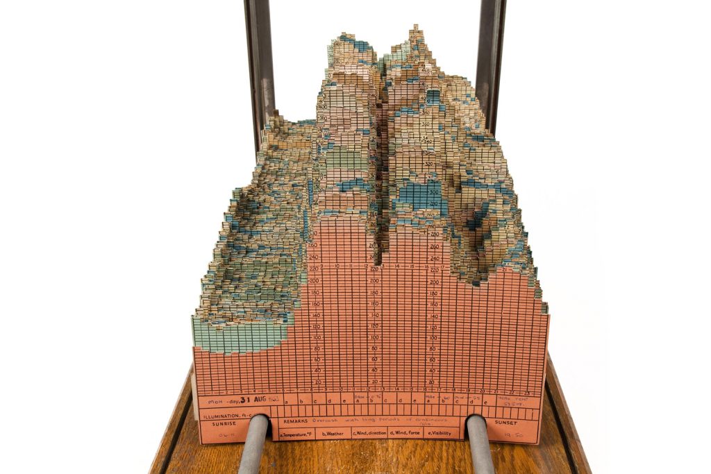
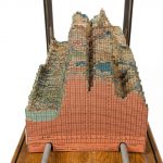
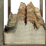
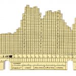
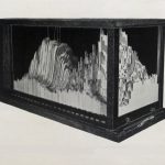
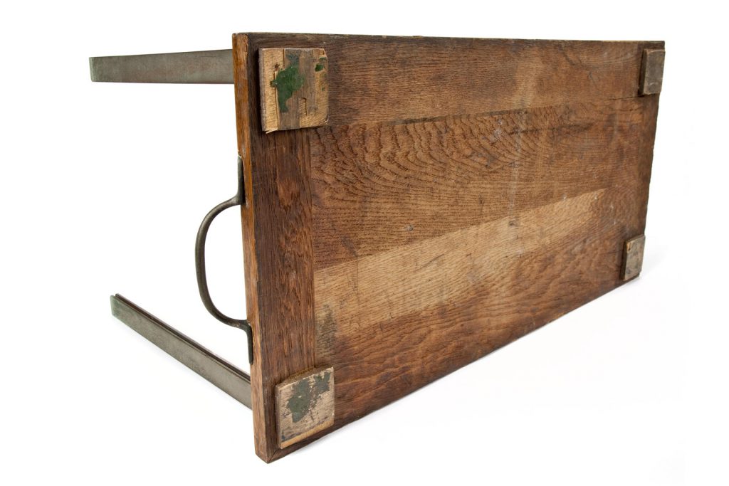
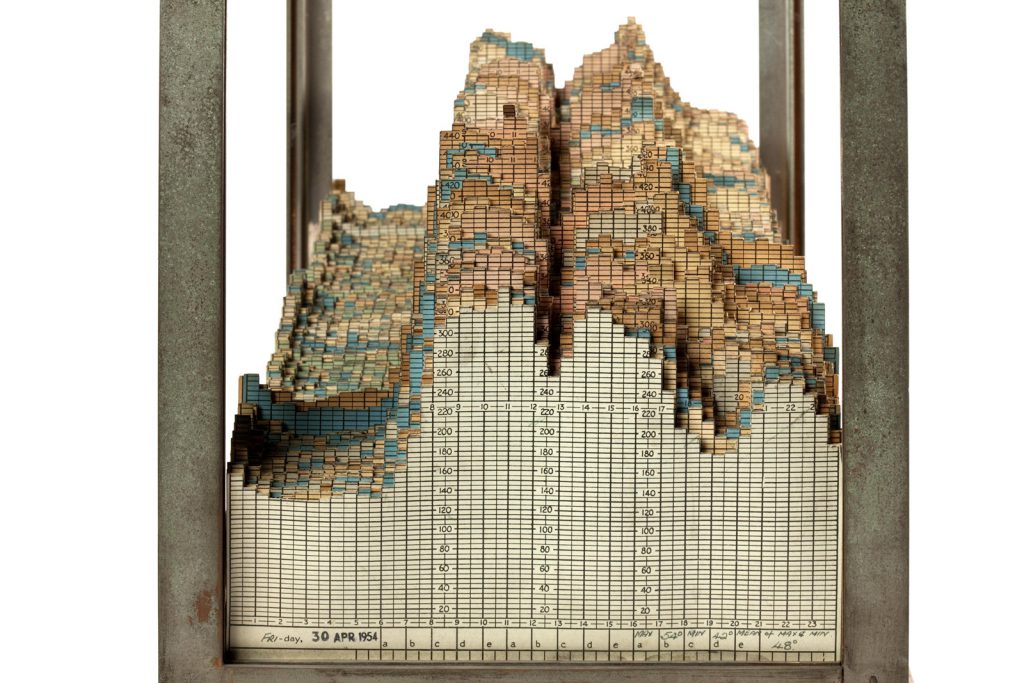
The chart is comprised of 675 cards held in place by two metal rails running the full length of the object, with steel uprights in each corner of the wooden base (see Figure 3). It is quite large – 67 x 31 x 36cm – about the size of a desktop printer, and heavy, but it has a handle at each end to make it portable. It was formerly glazed, and the broken fragments of glass are still stored with the object. Four green felt pads on the underside of the object suggest it was treated as a decorative object, and possibly placed on valuable wooden furniture (see Figure 4).
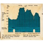
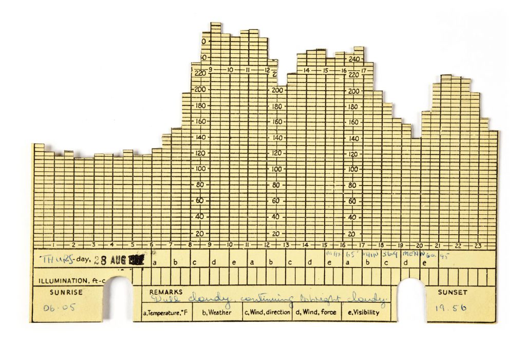
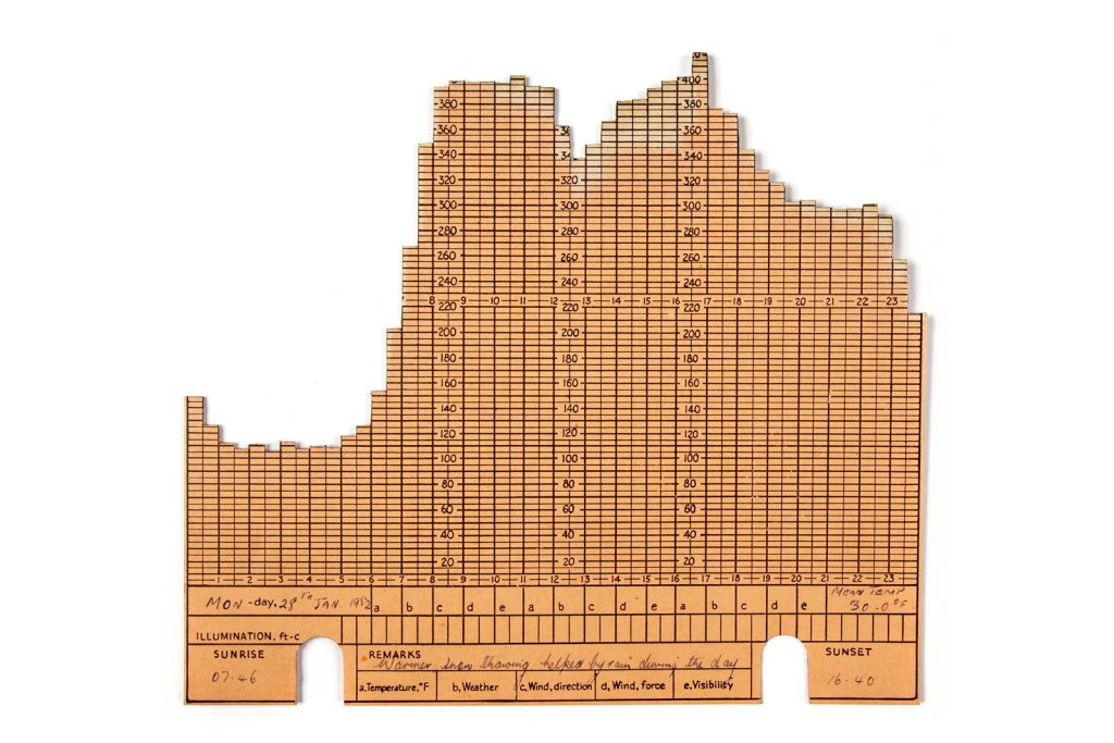
Each card shows the demand for electricity in megawatts (MW) for each half-hour period over 24 hours, from 2 October 1951 to 30 April 1954 (see Figure 5). Despite the accompanying key showing a seven-day week, there are only cards for Monday to Friday, mass printed in the five colours, and then annotated with a date stamp and a handwritten prefix for the day of the week.
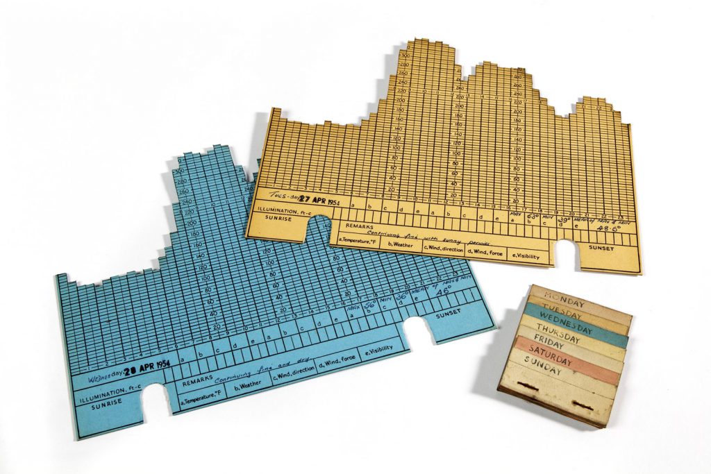
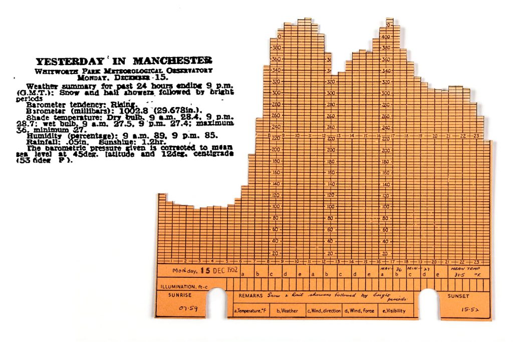
The time of sunrise and sunset is marked on each card, as is temperature and ‘remarks’ on the weather. These remarks match the daily weather summaries for the past 24 hours for Manchester, published daily in the Manchester Guardian (see Figure 6), and were written onto the cards in more than one pen and handwriting. Rainfall is occasionally noted, but other boxes for ‘Wind, direction’, ‘Wind, force’ and ‘Visibility’ are never completed.
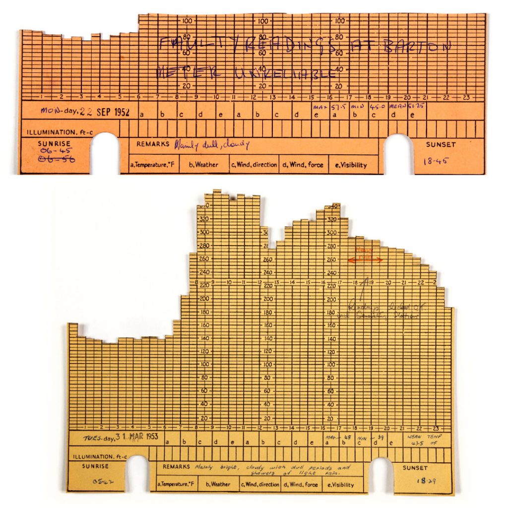
There are also occasional annotations written onto the graphical section of the card, two of which give clues about the geographic area from which the data was drawn. The two cards shown in Figure 7 refer to ‘Barton’ and ‘generating stations’ in the plural suggesting the area included Barton power station, and at least another. Using data on plant capacity from Swale’s Forerunners of the North Western Electricity Board (Swale, 1963), and the value of the highest peak demand (450 MW on Tuesday 2 December 1952), we surmise that the meter readings were taken from generating stations in the Board’s Sub-Area Number 1 – Manchester, the generating stations that were owned by Manchester Corporation before nationalisation in 1948.
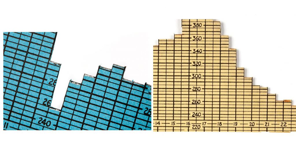
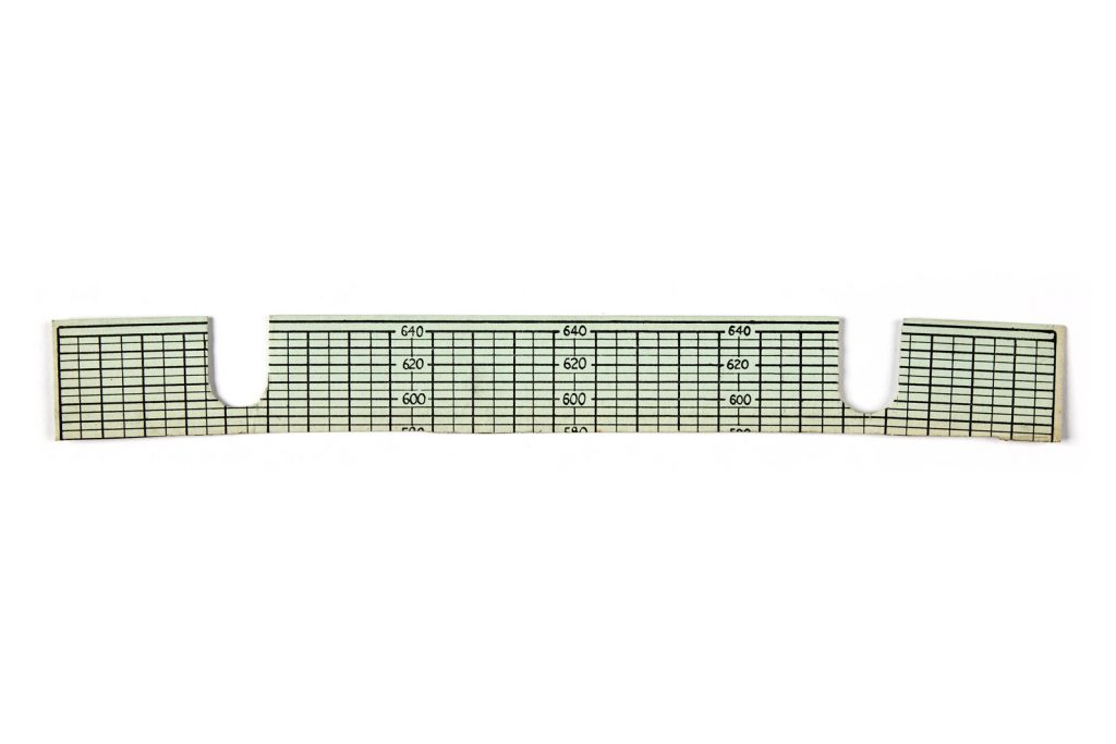
Traces of pencil and red pen ink across the profile of cards suggest that the data values were drawn onto the card before being cut by scissors or a clipper (see Figures 8 and 9). The height of the card from which they were cut is evidenced by an offcut sandwiched in the middle of the model (see Figure 10) – the maximum demand printed on the card is 640 MW.

Taken together, evidence from the object led to the following interpretations. The chart was probably assembled day-by-day, or for a group of days, rather than all at once, and the values were cut into the cards by hand – a time consuming task. Daylight hours and weather variables were important enough to record, and the whole chart was probably on display for some period after initial construction. We were not able to find a similar object with which to compare it for Fleming’s (1974) step of ‘evaluation’, but it seemed to have a purpose beyond the recording of daily load curves – a need to see the data in relationship, or trends. An analysis of these trends would also fulfil Fleming’s third step of ‘cultural analysis’: the relationship of the object to its culture.
Trends and rhythms of demand
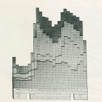
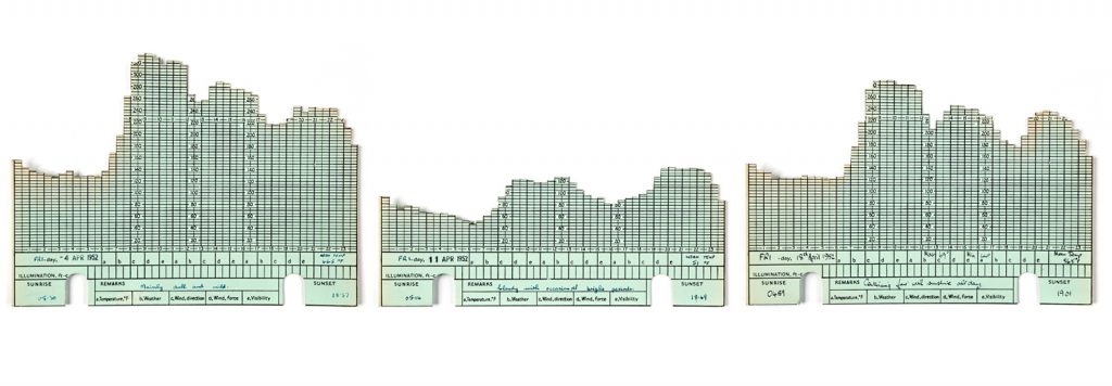
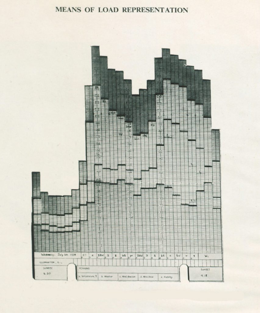
https://dx.doi.org/10.15180/180905/003The chart provides information on the timing of demand, especially when the demand peaks take place and how high they reach, but also on the seasonal changes. Most importantly, perhaps, the object vividly suggests a distinctive rhythmic patterning of daily load, as each day follows a roughly similar demand profile, with public holidays and seasonal changes providing the most distinctive alterations (see Figure 11). The chart includes both domestic and commercial/industrial demand, but does not give clues to puzzles such as what is the base load during night time, what makes the afternoon peak, and how is domestic work stretched over the day? In this section, we elaborate on these questions, before speculating on whether these were the kinds of questions the users of the model at the time were interested in.
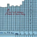
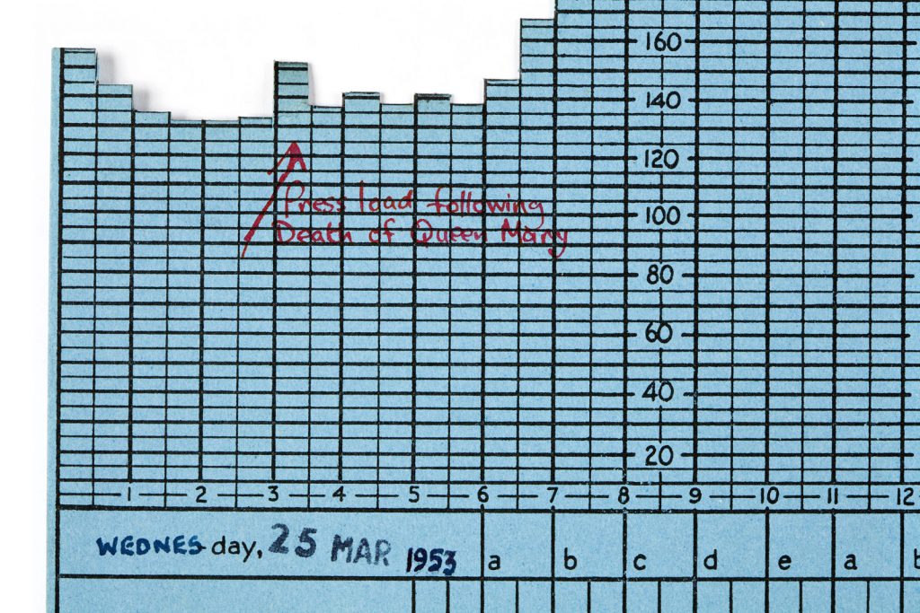
Each load curve is characterised by a period of low night-time demand. The night-time base load most likely consists of activities that were either in constant demand for electricity, such as the functioning of the cold chain; or activities that mostly took place in the night time, such as street lighting, night-time storage heating, or some commercial activities such as the working of press office machines, newspaper printing, or bakeries. Even though the object does not give us clues about what electricity was used for, some cards are an exception. For example, the death of Queen Mary on 25 March 1953 was marked down on one of the cards as a special event causing a peak at 03:00 due to a sudden press load from newspaper printing (see Figure 12).
After the relatively constant night-time load, demand doubles or more for the morning hours from 06:30 onwards. Unlike today, factories, shops and offices in the 1950s did not routinely function around the clock (Agger, 2015), but were run on weekdays from 08:00–17:00, and this partially explains the steep increase. Studies of domestic demand in the 1950s suggested that much of domestic work – which was at that time electrifying fast – took place in the mornings (BEA, 1950a). The mass market for energy intensive home appliances was not yet mature, and until the 1960s, most British families spent discretionary income on furniture, clothes and home entertainment, such as a radio and television, rather than on labour-saving devices such as washers or fridges; with the vacuum cleaner as an exception (Trentmann and Carlsson-Hyslop, 2017). However, the use of space heaters such as electric fires, water heaters, and wash boilers (that were more often rented than owned) did accentuate the weekday morning load.
The morning hours were followed by a lunch break at noon, with a dip in demand of 60–90 megawatts (see Figure 13). The regular reduction in electricity demand during the lunch hour suggests that some machines, appliances or lighting were either switched off for that time, or used in a different, less consuming, mode. The synchronisation of commercial and industrial activity around the lunch hour is remarkable compared to today (Durand-Daubin, 2015).
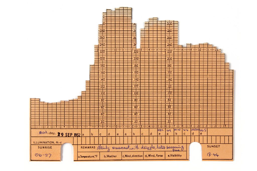
Another peak, often the steepest of the day especially in the winter months, takes place in the afternoon around 16:00–17:00. This afternoon peak is interesting in many respects. The peak could be made from demand for lighting during the darker office hours, and heating and cooking when many people start to return home. When domestic rhythms overlap with industrial and commercial patterns of demand, consequences on peak demand can be significant. In a Manchester Guardian article on 11 December 1954 it was stated that, ‘If the B.B.C. would alter the Children’s Hour programme on television by half an hour it would save the Eastern Electricity Board a full power station on peak demand’ ( The Manchester Guardian, 1954). According to the article, the nearly four million television sets in the UK in 1954 were a major contributor in shifting the peak demand from 08:00 to the time of broadcast: 17:00. A three-peak pattern emerges in the month of August, when the demand for lighting occurs later in the day and becomes separate from the ‘teatime’ peak (see Figure 14).
In addition to a clear daily profile, the chart illustrates a distinctive seasonal variation in electricity demand. There is growth in demand in the winter months due to increased need for heating and lighting. On national holidays, most notably during Christmas and Easter, and the holiday season in July and August, demand plunged significantly, as Figures 15 and 16 illustrate. The load on national holidays was primarily domestic demand, corroborated by statistical reports, according to which domestic demand accounted for one third of electricity consumption in the early 1950s in the UK (Office for National Statistics, 2017).
Our analysis of the trends demonstrated how the data could have been used at the time. Factors such as peaks in demand, their maximum values, and the seasonal variations were made manifest – materialised – in the object. Was it this data, and the daily activities of which it was constituted, that was of interest to the users?
The object in use
https://dx.doi.org/10.15180/180905/004Our close study of the object, and the trends revealed, led us to speculate that its use was probably related to one or more of three important responsibilities of the electricity boards: forecasting, load-shifting and tariff-setting, and research and development. At this stage we used these lines of enquiry as keywords for interrogating the archive, to test our interpretations, and draw some conclusions about the significance of the object.
For forecasting?
Our first thought after examining the object and its data was, ‘Who would want to see the trends in electricity demand over time?’ Who were the CEGB ‘planners’? One possibility was those responsible for forecasting. Research in the Electricity Council archives at MSI gave an insight into this technical process. An article on long-term planning in the electricity supply industry noted that forecasts of demand were made for a number of specific purposes: for the operating programmes of existing plant, the provision of new plant, and the future strategy on the type and location of generating stations and transmission lines (Melling, 1964, p 3). As the design, construction and commissioning of a generating station took at least five years, forecasts in c.1954 would inform planning for the early 1960s.
In the late 1940s and 1950s there was much scrutiny of the methods of forecasting, not least because the industry had only recently been nationalised, and Area Boards were encouraged to use ‘common bases, principles and methods of estimation’ (BEA, 1950b, p 1). In addition, growth in demand during this period was consistently underestimated (), and the variation in winter weather could alter the maximum demand on the Grid system as a whole by at least a thousand megawatts ([ref id=”3″ >BEA, 1950b, p 16). As a consequence, the Load Estimation Working Party, reporting in October 1950, recommended that from the winter of 1950–51, Area Boards be urged to start: ‘the systematic collection of (i) daily loads at B.E.A. supply points and (ii) daily temperature readings (preferably at midday) at suitable positions in each Sub-Area’ (BEA, 1950b, p 17). (B.E.A. supply points were power stations or sub-stations at which the Area Board took a supply from the central authority, the British Electricity Authority).
Data was to be collected by the Area Board’s District Officers and entered into standardised forms, specimens of which were appended to the Working Party report. However, the forms were only concerned with the maximum demand on the Area Board, between 07:00 and 19:00 on working days, November to February (BEA, 1950b, Appendix B, Table 1). This indicates the window in which they expected to witness peak demand: during the working hours of a weekday, in winter months. The report noted that ‘Where practicable, separate records should be kept of morning, midday and evening peak loads’ (Ibid, Appendix A, p 5), but for the purposes of forecasting this level of detail was not required. Planning for engineering requirements (generating plant and transmission lines) appeared to need only data on the maximum demand.
At a more local level, Hughes (1983) describes the use of load curves by ‘load dispatchers’ – those tasked with controlling the supply from generating stations to meet demand. ‘Load forecasting’ required the retention of historical records, including factors directly affecting the magnitude, location and variation of the load, such as the weather (, p 367). In early twentieth-century Chicago, the load dispatcher was ‘not only a troubleshooter but something of a historian. At his disposal were load curves… By analysing these, the dispatcher anticipated loads resulting from the social customs and industrial routines of Chicago’s population’ ([ref id="15"]Hughes, 1983, p 214). Hannah (1979) also states how load dispatchers developed ‘a wealth of knowledge on the social life and working routines of the population they served’ (Hannah, 1979, p 125). Could this have been a use for the model in 1950s Manchester? As discussed above, and demonstrated in Figure 15, the trends in use from year to year across the period (1951–54) were not dissimilar, but spikes in demand were problematic. The electricity supply industry clearly had a need for data to help understand and manage load profiles and meet the fluctuating demands of the daily pattern, and this had a financial imperative as well as for resilience and long-term planning. This led us to our second speculation on the importance of the object for load-shifting and tariff-setting.
For load-shifting and tariff-setting?
Visualisations of the daily load curve, at thirty-minute intervals, gave information at a glance about the fluctuations in demand. Steep peaks in electricity usage in the mornings and evenings did not make for an efficient use of the supply system, and shifting the peak load to ‘flatten’ the curve made financial sense for electricity suppliers. Knowing exactly when those peaks occurred, and of what practices they were constituted, enabled the supply industry to think about ways to steer changes in the timing of demand, such as by promoting the use of night-storage heaters rather than on-peak electric fires (Carlsson-Hyslop and Pearson, 2012).
Another means of managing demand was the introduction of tariffs, enabling suppliers to set prices for more accurate forecasting, and to incentivise changes in electricity demand with cheaper off-peak tariffs. From 1948, one of the North Western Electricity Board’s primary tasks was the standardisation and simplification of tariffs for domestic, industrial, farm and commercial customers (Frost, 1993, p 68). In 1952, the Board introduced a new tariff for both domestic and industrial users, which replaced all the previous tariffs. During the decade 1951 to 1961 there were only two tariff increases, in 1955 and 1957, raising charges by fifteen per cent. But, as Hannah (1979) notes, the pricing policy of the industry had not been significantly modified until this decade (Hannah, 1979, p 203). An ability to see the times and seasons of peak demand at a glance would undoubtedly have benefitted those tasked with managing demand.
If the aim of the chart was to help intervene in patterns of societal synchronisation, shift the timing of what people do, and change the rhythm of the day, were these efforts successful? Recently scholars have suggested that dynamic pricing of energy has a limited effect on when people use energy (Torriti, 2015). This is because energy is used for social practices that are shaped by infrastructural and institutional boundaries and follow a fixed social rhythm (Shove and Walker, 2015). Against this, load models have lately been joined with time-use data surveys in thinking more carefully about what energy is used for – for example, what kinds of activities contribute to peak demand in the evenings. But, even today, as Torriti (2015) argues, the focus of demand-side management is persistently on tools that rely on changing energy demand through tariffs rather than drawing attention to why energy is used in the first place and which activities could be shifted from peak periods to off-peak periods.
Even if the object was intended to assist with load management, this does not fully explain the level of detail recorded on each card, which would have been hidden when assembled as a whole. Annotations such as the death of Queen Mary, and that meter readings had been verified (see Figures 12 and 7) convey date-specific information. These indicate the cards had a use before assembly, but whether those responsible for load-shifting and tariff-setting valued that level of data, and if so why, is difficult to discern.
For lobbying or demonstration?
The time invested in producing the model led us to consider a third possibility: that the object was related to lobbying or demonstration. Referring to scale models for performativity, Franck Cochoy describes how they are ‘less abstract than words, but more abstract than things…a bridge between language and practice’, and ‘embodied theories’ (Cochoy, 2010, p 308). There is the simple fact that the model might have been ‘putting an idea to work’: ‘showing’ being better than ‘just talking about it’.
As noted above, the model dates to the end of the analogue era. A recollection by R G Hancock, Head of the Intelligence Section of the Electricity Council, notes that computers were being used on the CEGB’s data sets from around the early 1960s (Hancock, p 16A), so perhaps the construction of this model was a means of lobbying for such resources? Perhaps it was to prove that creating this data visualisation with manual methods took this many hours/days? An organisational change in 1954, from the British Electricity Authority to the Central Electricity Authority could also have been a driver for lobbying and/or research, e.g. to show the Sub-Area’s demand profile to a new audience.
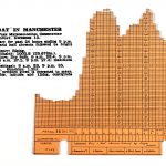
This is supported by the evidence that the model was highly esteemed, and of its possible role as a showpiece. The green felt pads on the underside suggest it was destined for a boardroom table. There was also the expense of the colour-printed cards, and the time invested in transferring data onto the cards and assembling the whole. It was also probably ‘on display’ for some time. The degree of fading where cards were exposed to the light is broadly consistent across the whole (see Figure 17). An ‘interpretation panel’ stored with the object (see Figure 18) suggests that for at least some of its lifetime it was used for instructing non-specialist audiences. Whether the object performed these roles at the time, or subsequently, is difficult to distinguish.
Use and users revealed
https://dx.doi.org/10.15180/180905/005Speculation about the model’s use for engineering or commercial planning directed research in the MSI archives towards the Electricity Council’s Chief Engineers’ Conference and the Chief Commercial Officers’ Conference. In following a lead through the former’s Research and Technical Planning Committee, we discovered that this model was by no means unique. A list of utilisation research papers amongst the standing committee papers contained reference to technical report K/T107, which covered:
The utility and preparation of two- and three-dimensional representations of load, more particularly daily load curves…load models, and load maps. An improved design of load model is described, and commercial arrangements have since been made for the supply of suitable cards, etc., for Boards wishing to use this form
Without having worked with the object, and speculated on its use(s), it is unlikely we would have found this documentary source, or realised its significance. Only by using the object and archive together did we make the connection between the two.
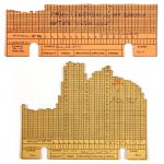
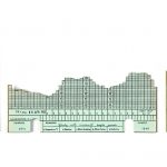
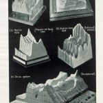
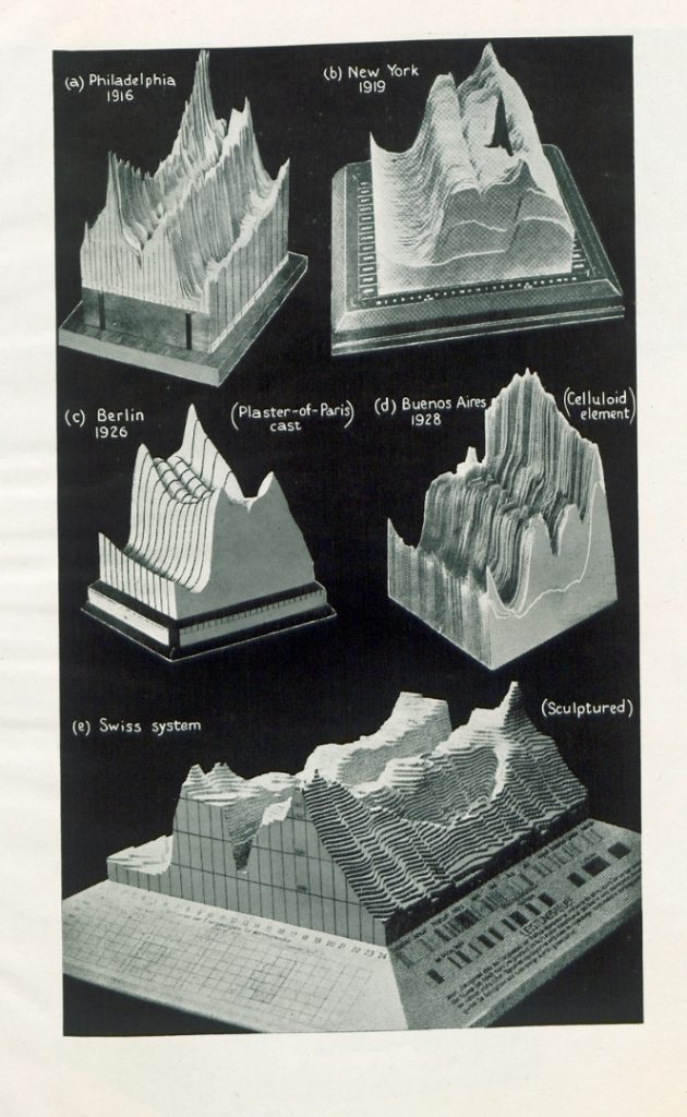
Report K/T107 (Schiller, 1945) proved to be an invaluable source in understanding the object’s use and users. The illustrations were of immediate interest – one depicted a load model of identical construction to ours (see Figure 19), and another depicted identical cards (see Figure 20). The first illustration of the report showed load models made between 1916 and 1928, in North and South America and Europe (see Figure 21), indicating there was an existing practice of load representation (and data visualisation) that the models of the 1940s and 1950s had drawn upon.
The report’s purpose was to recommend that electricity suppliers produce load models for ‘comparative load research’, ‘load analysis’ and ‘electricity-supply economics’. This was as we had deduced. Knowledge of the composition and trends in the demand for electricity were fundamental to the engineering and commercial planning of suppliers, and forecasting and load management techniques ensured the financial success of the industry. The author of the report, Paul Schiller, was an engineer with the Electrical Research Association (ERA), an organisation jointly funded by the government’s Department of Scientific and Industrial Research and subscriptions from members. Section K (hence ‘Report K/’) was established in 1941 to conduct cost research, with Schiller as the head, ‘pioneering the scientific analysis of load curves and consumptions’ (Hannah, 1979, p 203). A thorough investigation of the work of Schiller and Section K is beyond the bounds of this article, but he distinguished the purposes of ‘load research’ as ‘the ascertainment of the load characteristics of each of the principal classes of consumer…of interest chiefly in allocating costs’, and ‘the different types of load’ and management techniques in order to encourage ‘desirable loads, appliances and methods by sales propaganda [and] tariff measures’ and to discourage those that appeared ‘undesirable’ (Schiller, 1952).
Report K/T107 communicated that the ERA provided the specifications for the cards and cabinet in ‘standardised form’, and shared the names of printers and cabinet makers with ERA members. The report went on to advise:
The best way of building up an annual load model is by having each day’s load curve cut out and put into the receptacle immediately the readings become available. Upon completion of the first year, the load model for the subsequent year is added, and when this is complete, the model for the preceding year is removed and stored
It was also noted that the transparent cover could be easily removed to enable cards to be ‘picked out and assembled together’ for particular comparisons (). Together, these passages explained the need for data at a daily and aggregate level, and the reasons for producing a receptacle to hold the cards for this duration.
The report clearly explained the position of our load model within the history of load representations, the means by which it was constructed, and some of the motivations for its use. But was it used in other ways at the time, or subsequently? Who used this object, and when? These were questions for further research.
Conclusions
https://dx.doi.org/10.15180/180905/006Complete knowledge of the use and users of this 3D chart of electricity demand will always remain elusive, as there is likely to have been a multitude over its sixty-year lifespan. Our close inspection of the object through a dual methodology, and the use of this analysis to inform archival research, enabled us to generate three possible roles for the object at the time of its construction, and these were in part borne out by the evidence. We hope that this case study demonstrates the value of collecting, and studying, objects and archives in parallel, and from different disciplinary perspectives.
Key questions remain, that were not answered by our research in this instance. Why did the North-Western Area Board choose to produce a load model for this region in these years? Was it timed to coincide with the significant changes in pricing policy? What exactly was it used for, and by whom? The data was not stratified by the principal classes of consumer, but it did reveal some of the everyday practices of which the demand was likely to have been constituted. Why was this particular model retained? It is likely that other research methods would be needed to answer these questions, such as oral history interviews of electricity supply industry employees, as the archive records are not currently catalogued to the degree needed to pinpoint this specific work, by a specific Area Board, at a specific time.
A noteworthy finding is that the ERA report also documented an interest in the data for legacy. The cards were to be stored as an historical record, and this goes some way to explaining why it was retained by the CEGB for long enough to become part of MSI’s collection, with an interpretation panel added to the object somewhere along the way. This begins to illuminate some of the layers of use inherent in the object’s lifespan: as a tool for informing the work (and business) of the electricity supply industry; as an historical record of data; as a demonstration or instructional object; and as a heritage object in a museum collection.
The object remains important as a tangible record of past practice, both of the electricity supply industry and its consumers. We have managed to read this record by delving into the history of Manchester’s electricity development, and the archival evidence about the use and development of 3D load models. Objects such as this can be revealing in terms of the larger history of energy supply and consumption because they represent the practice of the time. The object tells us – and further prompts us to think about – stories about demand over time, and in time, and how our practices of everyday life constitute this demand. For this reason, they should be looked at carefully. It is also pleasing that the size, colour and tactile character of the object make it appealing to today’s museum audiences, and in the Spark of Life exhibition we have taken the opportunity to share these stories. Now perhaps we can offer our audiences a new interpretation: of the object as a tool, as well as historical data.
Acknowledgements
We are grateful to colleagues who offered comments and suggestions on work-in-progress at the Material Practices of Energy Consumption workshop (15 September 2016), DEMAND seminar (16 November 2016), and Science Museum Group Research Conference (23–24 November 2017).
This work was supported by the Engineering and Physical Sciences Research Council [grant number EP/K011723/1] as part of the RCUK Energy Programme and by EDF as part of the R&D ECLEER Programme.
Tags
References
Media in article